Having a website is a must today. But for many freelancers and small business owners, design can feel overwhelming. Maybe your site looks messy. Or maybe it’s hard to use on a phone. You know it needs help—but you’re not sure where to start.
Bad design can cost you visitors and money. If people don’t trust your site, they won’t stay. If it’s slow or confusing, they’ll click away. That means fewer calls, fewer sales, and more stress. You’ve worked hard to build your business. Your website should show that, not hide it.
Here’s the good news: designing a great website doesn’t have to be hard. In this guide, you’ll learn how to build a site that looks clean, feels easy to use, and matches your brand. You don’t need to be a tech expert. You just need the right steps, and that’s what this guide will give you—simple, clear tips that work.
Let’s take your website from “just okay” to something you’re proud to share.
Table of Contents
Why Website Design Matters More Than Ever
Your website is more than just a page online—it’s your digital shop window. For freelancers and small business owners, it often acts as your first meeting with a new customer. If your design looks old or messy, people might think your work is too. But if your site is clean, simple, and easy to use, it tells visitors you care about quality.
Good design helps people find what they need quickly. Whether they’re looking for your services, prices, or reviews, they should be able to get there without thinking too hard. A well-designed site can even help you rank better in search engines, making it easier for new customers to find you.
The best part? You don’t need to be a designer to have a great-looking site. Tools like WIX and WordPress make it easy. And when you understand what makes a design work—like simple layouts, good colors, and clear text—you can build something that’s both smart and beautiful. In a world where people make fast choices, a good website can help you win trust in seconds.
First Impressions Count: How Design Affects Trust

Most people decide how they feel about a website in just a few seconds. That first look can either build trust or send someone away. This means your design matters a lot, especially if you’re a freelancer or small business owner trying to stand out.
If your website is cluttered, slow, or full of tiny text, visitors might think your business isn’t professional. On the other hand, a simple design with clear headings, good spacing, and easy navigation tells people you know what you’re doing. It’s like dressing well for a meeting—you want to make the best first impression.
Trust also comes from details like using your real name, showing your work, and including reviews or testimonials. When people see these things, they feel safer. They know they’re not just clicking around a random site. They’re learning about a real person or team who takes pride in their work. So before you even speak to a client, your website is already doing the talking. Make sure it’s saying the right things.
Choosing the Right Look for Your Brand
Your website should look and feel like your brand. This means the colors, fonts, and pictures you use all work together to tell your story. If you’re fun and creative, your site should feel that way. If your work is serious and clean, the design should match that too.
Start by picking two or three main colors that reflect your brand. Use these colors on your buttons, headings, and background areas. Choose one or two fonts that are easy to read, and use them the same way across your site. Don’t mix too many styles. It can make your site look messy.
Photos also matter. Use real images if you can—of your work, your team, or your workspace. These help people connect with you. Stock photos are okay, but try to pick ones that feel natural and not too posed. Together, these design choices make your site feel personal and clear. When your look matches your message, people will remember you—and that’s the goal.
Keep It Simple: Layouts That Work
A simple layout is one of the best ways to make your website easy to use. You don’t need flashing banners or lots of fancy features. In fact, too much on a page can confuse visitors. The best sites stick to clean, clear sections with plenty of space in between.
Use a basic structure that’s easy to follow. Start with a header at the top, add your main message or photo, and then show your services, about info, and contact details. Keep things in the order people expect to see them. This makes it easier for visitors to stay focused and move through the site.
Always test your layout on both desktop and mobile. Make sure buttons are big enough to click, and text is easy to read. Your layout should guide the user’s eye from top to bottom without confusion. When people can find what they need fast, they’re more likely to stay—and more likely to buy or get in touch. Simple really does work best.
Mobile Comes First
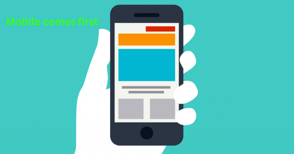
Most people now visit websites on their phones, not on a computer. That means your site must look and work well on small screens. If it’s hard to use on mobile, people will leave fast—and they probably won’t come back.
A mobile-first design means you plan for phones first, then make sure it works on bigger screens too. This helps your site load faster and look cleaner. Keep your menus short, your text easy to read, and your buttons big enough to tap. Avoid cramming too much into one screen. Less is more on mobile.
Try testing your site by opening it on your own phone. Click around like a visitor would. Can you read everything? Can you find the contact button fast? If not, make changes until it feels smooth and simple. A mobile-friendly site shows your visitors that you care about their time—and their experience. That goes a long way in building trust and winning new clients.
Make It Easy to Find Things
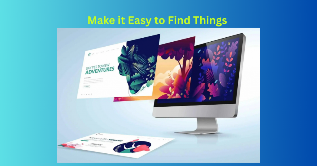
When someone lands on your site, they should know where to go right away. A confusing site will make people leave. That’s why good navigation is key. You want to guide your visitors, not make them guess where things are.
Start with a clear menu at the top of your page. Use simple words like “Home,” “About,” “Services,” and “Contact.” Don’t use tricky names that people don’t understand. Keep the number of menu items small—five to six is enough. If you have more info to share, use sub-pages or drop-downs.
Also, use buttons and links that stand out. Make sure they lead to the right pages. If you offer something special—like a free call or quote—make that button bold and easy to spot. Think about how someone new to your site would move around. If you make it easy to explore, they’ll stay longer and feel more confident about working with you.
Show What You Do with Images and Words
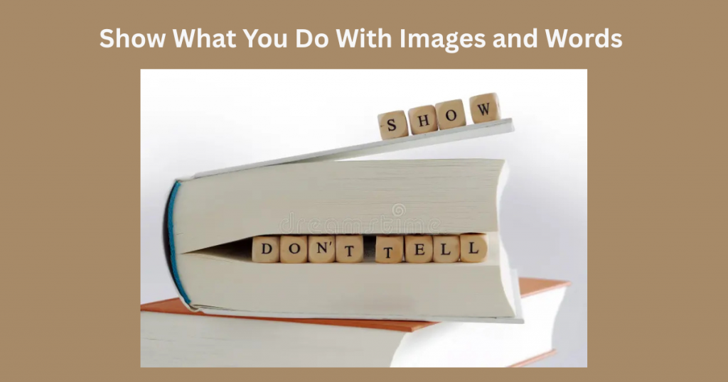
People want to know what you offer right away. That’s why your website should clearly show what you do. Use short text and strong images to make your message clear. Don’t expect visitors to read long paragraphs—they won’t.
Start with a headline that says what your business does in one sentence. Under that, add a few bullet points or a short paragraph with your key services. Keep your words simple and friendly. Talk like you’re explaining it to a friend.
Images help too. Use real photos of your work, team, or space, if possible. If you use stock images, choose ones that feel natural. Make sure every image supports your message. A clean photo of your product or service in action can do more than a block of text. When words and pictures work together, visitors will quickly understand what you do—and why it matters.
Build Trust with Smart Design Choices
Trust is a big part of winning new clients. If your site looks clean and works well, people feel more confident in you. But if it looks outdated or broken, they may leave before even reading what you offer.
Start by keeping your design simple and your layout neat. Use clear fonts, soft colors, and enough white space so nothing feels too crowded. Make sure everything works—buttons, links, and forms. Broken parts on your site can make visitors think your business isn’t reliable.
Also, show real signs of trust. Add customer reviews, logos of past clients, or certifications if you have them. Use your real name or photo on the About page. These small things help people see the person behind the brand. When your site feels human, honest, and easy to use, it builds trust. And that trust can turn visitors into customers.
Tools to Help You Design Without Stress
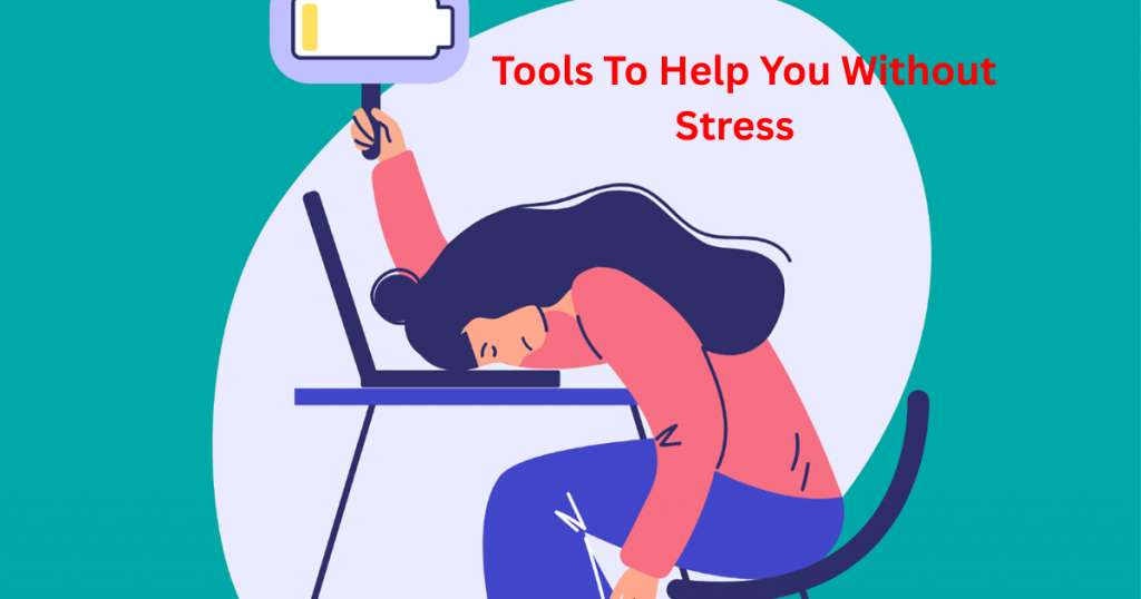
You don’t need to be a web expert to build a great site. There are tools made just for people like you—freelancers and small business owners—who want something easy, fast, and good-looking.
WIX is a great choice for beginners. It lets you drag and drop sections without writing any code. You can pick from many templates and tweak them to fit your style. WordPress is also strong if you want more control and don’t mind learning a bit more. Both platforms have step-by-step guides and support when you need help.
Other tools like Canva help with images, while Google Fonts offers free font choices. If you need colors, try tools like Coolors or Adobe Color. These help you pick the right shades for your brand. With these tools, you don’t have to feel lost or stuck. You can build a site that looks clean and works well—without stress or guesswork.
Final Thoughts
Building a great website doesn’t have to be hard. With the right design, clear layout, and smart tools, you can create something that truly works for your brand. These tips are here to help you grow online and connect with more clients.
Don’t wait until your site feels “perfect.” Start simple, test it, and improve it as you go. What matters most is that your website shows who you are and what you offer in a clear way.
If you need help or want more advice, feel free to reach out. You can email me at info@salahs-portfolio.co.uk—I’d be happy to chat and help however I can.
FAQs
1. Why does simple website design work best?
Simple design helps people find what they need fast. It’s easier to read and looks more professional.
2. What is mobile-first design?
It means building your site for phones first, so it looks and works great on small screens.
3. How do I make my website look more trustworthy?
Use clean design, working links, clear contact info, and real reviews or photos.
4. Do I need professional photos?
Not always. Real, clear photos of your work or team are better than fancy stock images.
5. What tools can I use to build my site?
WIX is great for beginners. WordPress is better if you want more control. Canva and Coolors help with design.
6. Should I use a template or start from scratch?
Templates are fine and save time. You can still make them your own with custom images and text.
7. How many pages should my website have?
Start with the basics: Home, About, Services, and Contact. You can add more later.
8. What kind of text works best on websites?
Keep it short and clear. Use friendly words, and speak directly to your reader.
9. Why are layout and spacing important?
Good layout and spacing help people read without getting overwhelmed. It makes your site feel calm and easy to use.
10. Can I ask for help if I get stuck?
Yes! You can email me at info@salahs-portfolio.co.uk and I’ll be happy to help you out.

I’m an organised and curious person with a passion for technology and investigative work, currently developing my skills through hands-on experience and IT studies. I enjoy solving problems, working with others, and learning something new every day.