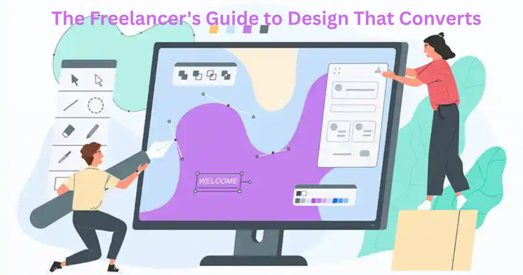
You poured hours into your website, but clients aren’t biting. The phone stays silent. Your portfolio gets views—but no bookings. Frustrating, right? Here’s the hard truth: bad design is costing you clients. Tiny text, cluttered layouts, and cheap-looking colors make visitors leave fast. Even if you’re talented, poor design screams “amateur.” You don’t just lose sales—you lose trust before you even get a chance. Good news—you don’t need to be a designer to fix this. This guide shows you simple, proven design tricks that convert browsers into buyers. Learn how to pick colors that build trust, arrange your page so clients want to stay, and use free tools to look pro—no degree required.
By the end, you’ll have a website that works for you, not against you. Let’s turn those clicks into clients.
Table of Contents
Why Good Design = More Clients (The Simple Truth)

Your website is your digital handshake. Before clients read your services or prices, they judge your design. Good design builds trust fast. Studies show visitors decide in seconds whether to stay or leave. A clean, professional layout tells clients you’re serious. Messy designs? They make people doubt your skills—even if you’re amazing at your job.
Think about your favorite brands. Their websites feel easy to use, right? That’s no accident. Good design guides visitors where to click, what to read, and how to hire you. Colors, fonts, and spacing work together to create a vibe. Get it right, and clients feel confident choosing you. Get it wrong, and they’ll find someone else—fast.
The best part? You don’t need fancy tools or training. Small tweaks make a big difference. Stick around to learn which changes give you the most bang for your buck.
5 Design Mistakes That Make You Look Unprofessional
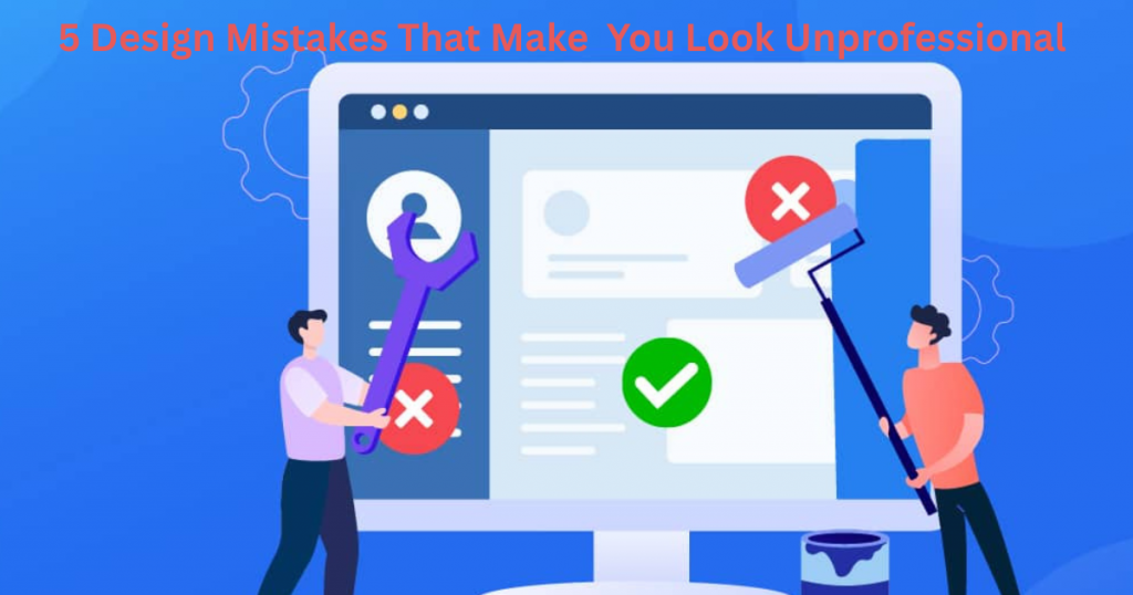
ver visited a website that felt “off” but you couldn’t say why? Chances are, it made these common mistakes. First: tiny, hard-to-read text. If visitors squint, they’ll leave. Second: cluttered layouts. Too many colors, fonts, or buttons overwhelm eyes. Third: blurry or cheesy stock photos. They scream “I didn’t try.”
Fourth mistake? Ignoring mobile users. Over half of web traffic comes from phones. If your site looks broken on mobile, you’re losing clients. Fifth: inconsistent branding. Different colors or fonts on each page confuse people. They’ll wonder if they’re even on the same site.
The good news? Fixing these takes minutes, not days. Keep reading for simple solutions to each problem.
The Lazy Designer’s Color Scheme Formula
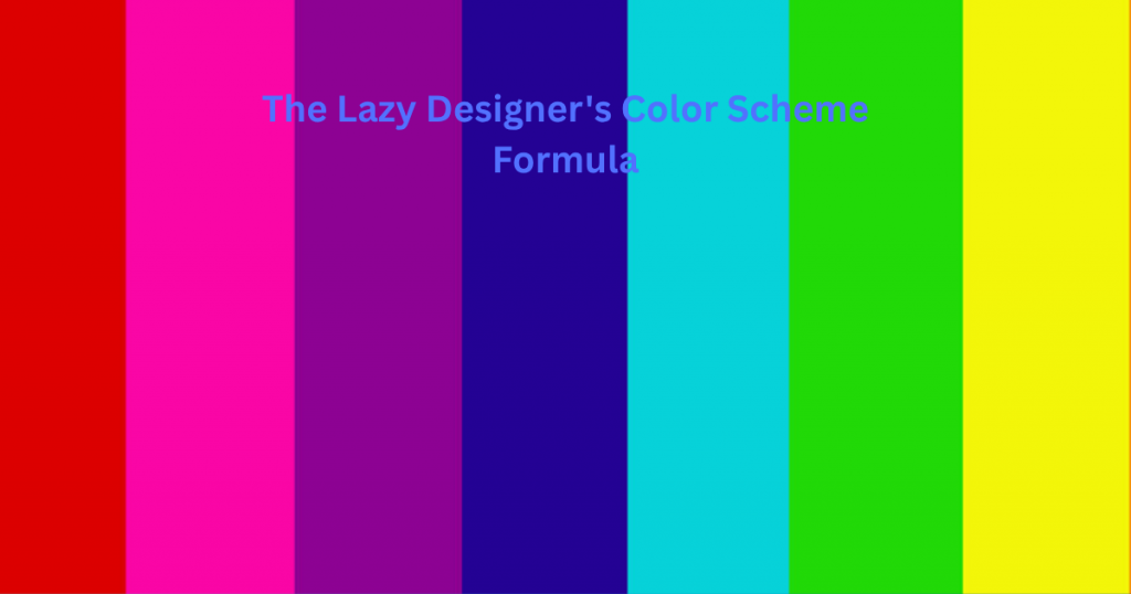
Picking colors shouldn’t feel like solving a puzzle. Here’s a no-stress method. Start with one main color—your brand’s vibe. Professional? Try navy. Fun? Go bright orange. Next, use a free tool like Coolors or Adobe Color. Type in your main color, and it suggests matching shades.
Stick to three colors max: one dominant, one accent, and one neutral (like white or gray). Too many colors compete for attention. Need inspiration? Check competitors’ sites or nature. A sunset’s blues and pinks always work well together.
Bonus tip: Use your accent color for buttons and important text. This guides eyes where to click. No art degree required—just follow this formula, and your site will look pro.
Fonts That Don’t Suck: A Beginner’s Guide
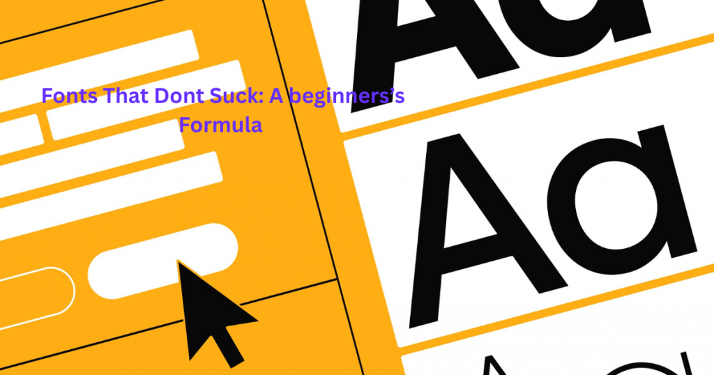
Picking fonts shouldn’t give you a headache. The right font makes your content easy to read and helps you look professional. Stick to simple, clean fonts for most of your text – they never go out of style. Fancy cursive fonts might look pretty, but they’re often hard to read on screens.
Here’s a simple rule: Use one font for headings and another for regular text. Google Fonts has hundreds of free options that work well together. Some safe bets are Open Sans, Roboto, and Lato – they’re clean, modern, and look good everywhere. Remember, if a font makes you squint, your clients will squint too.
Avoid using more than three fonts on your site. Too many fonts make your design look messy and unprofessional. When in doubt, keep it simple. Your content should be the star, not your font choices.
Where to Find Amazing Free Images (That Don’t Look Cheap)
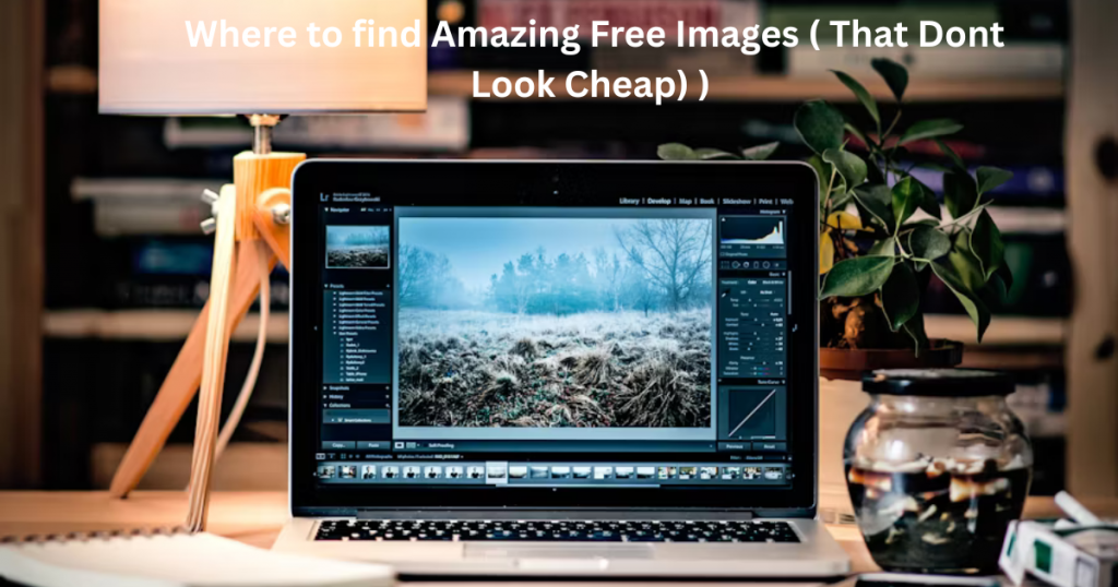
Bad stock photos can ruin a great website. You know the ones – fake smiles, awkward handshakes, and people laughing at salads. Luckily, there are places to find professional-looking images without spending a dime.
Try Unsplash or Pexels for high-quality, natural-looking photos. These sites offer real-life images that don’t look staged. For illustrations, check out Undraw or Humaaans – they provide customizable, modern graphics. Always look for images that match your brand’s style and feel authentic.
Remember to check the license before using any image. Most free sites require attribution, so keep track of where you got each photo. With these resources, you’ll never have to use cringey stock photos again.
White Space: Your Secret Weapon for Classy Design

White space isn’t wasted space – it’s your design’s best friend. It’s the empty area between text, images, and other elements. Proper white space makes your content easier to read and your design look more expensive.
Cramming too much on a page overwhelms visitors. White space gives their eyes room to breathe and helps them focus on what matters. Think about luxury brands – they always use plenty of space around their products. You don’t need fancy design skills to use this trick.
Try adding more padding around your text and images. Leave space between sections so they don’t feel crowded. Your content will look more polished and professional instantly. Remember, in design, sometimes less really is more.
Mobile Design: What Most Freelancers Get Wrong

Most freelancers design their websites on a computer – and it shows. The biggest mistake? Forgetting that over 60% of visitors use phones. Tiny text that’s readable on desktop becomes impossible to read on mobile. Buttons that work with a mouse are frustrating to tap with fingers.
Another common error is not testing on actual devices. What looks good in preview mode might break on real phones. Images that load fast on WiFi crawl on mobile data. Navigation menus that work great on desktop become unusable on small screens.
The fix is simple: Design mobile-first. Start with how your site looks on phones, then adapt it for larger screens. Use larger fonts (at least 16px), space out tap targets, and simplify menus. Your mobile visitors will thank you – and stay longer.
Real Examples: Before & After Design Makeovers
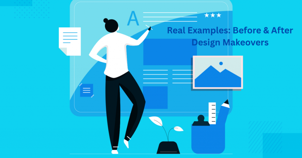
Nothing teaches design better than real examples. Take Sarah’s freelance photography site – her original version used 5 different fonts and a busy background. Visitors left within seconds. After simplifying to two fonts and using white space, her bounce rate dropped by 40%.
Then there’s Mike’s consulting site. His first attempt had tiny text, no clear buttons, and confusing navigation. After increasing font sizes, adding a clear call-to-action, and organizing his menu, he got 3 new client inquiries in a week.
These transformations prove you don’t need a complete redesign to see results. Small, strategic changes make a huge difference. Keep reading to see exactly what they changed and how you can do it too.
Design Maintenance: Keep Your Site Looking Fresh
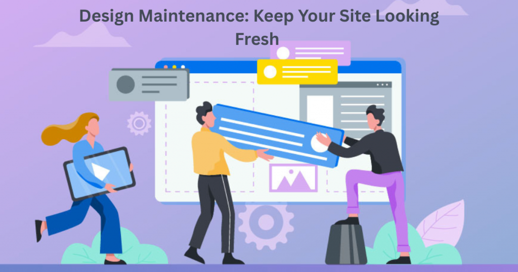
Your website isn’t a “set it and forget it” project. Like a car, it needs regular checkups to stay in top shape. Start with monthly reviews – test all your links, check for broken images, and ensure forms work. Outdated content makes you look inactive.
Update your portfolio with recent work every few months. Refresh testimonials and client logos annually. Design trends evolve – what looked modern two years ago might feel dated now. A simple color tweak or font update can give your site new life.
Set calendar reminders to review your site quarterly. Check how it looks on new devices and browsers. Small, consistent updates prevent big redesigns later. A well-maintained site builds trust and keeps clients coming back.
Final Thoughts
Great design isn’t about fancy tricks—it’s about making your website work for you, not against you. The strategies we’ve covered are simple but powerful. Whether it’s fixing mobile mistakes, using white space better, or keeping your site fresh, small changes add up to big results.
You don’t need to be a pro designer to make a big impact. Start with one tweak today, then build from there. Before you know it, your site will look more professional, attract the right clients, and help you stand out.
Stuck or need personalized advice? Reach out at info@salahs-portfolio.co.uk. Now go make your website shine—you’ve got this!
10 FAQs Based on the Blog
1. How do I know if my website looks bad on mobile?
Test it! Use your phone, ask friends, or try Google’s free Mobile-Friendly Test tool. If text is tiny or buttons are hard to tap, it needs work.
2. What’s the easiest way to improve my design fast?
Add more white space and simplify your fonts. These two changes make any site look cleaner instantly.
3. How often should I update my portfolio?
Every 3–6 months. Remove old work, add new projects, and refresh testimonials to keep it current.
4. Can I use free fonts for my business site?
Absolutely! Google Fonts has professional options like Roboto and Montserrat that work perfectly.
5. Where’s the best place to find free, non-cheesy images?
Unsplash and Pexels offer high-quality photos that don’t look like typical stock images.
6. My site looks messy—how do I fix it?
Cut clutter. Use fewer colors, stick to 2 fonts max, and space out elements so it’s easier to read.
7. What’s the biggest mobile design mistake?
Tiny buttons! Make sure everything is easy to tap with a thumb—no pinching or zooming needed.
8. How much white space is too much?
If your content feels disconnected or hard to follow, scale back. Otherwise, more space usually looks better.
9. Should I redesign my whole site or just tweak it?
Start with small fixes first (like fonts and spacing). Big redesigns take time—small wins keep you motivated.
10. How can I make my site look more expensive?
Use white space, high-quality images, and consistent branding. Simple = sophisticated.
Need more help? Email me at info@salahs-portfolio.co.uk—I’d love to hear from you!

I’m an organised and curious person with a passion for technology and investigative work, currently developing my skills through hands-on experience and IT studies. I enjoy solving problems, working with others, and learning something new every day.