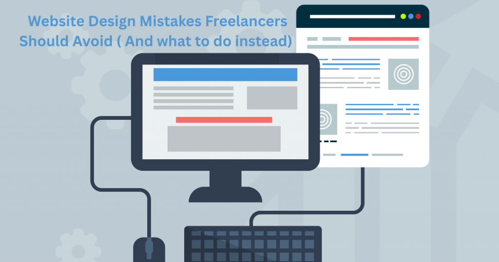
Are you struggling to get more clients from your website?
It might be because small but common design mistakes are turning visitors away.
A website that’s confusing, slow, or hard to use can make people leave before they even see what you offer.
The good news? These mistakes are easy to fix once you know what to watch out for.
In this post, you’ll learn about the most common web design errors freelancers make — and simple ways to avoid them.
By fixing these, you’ll create a site that looks professional and helps you get more leads and clients.
Table of Contents
Start With a Clear Purpose

Every great website begins with a clear purpose. Before you start designing, ask yourself what you want your site to do. Are you trying to get new clients? Showcase your work? Sell a product? Knowing this helps guide every design choice you make.
When you have a clear goal, your website can focus on what matters most. It helps visitors understand your message quickly. For example, if you want to book more clients, your site should make it easy for people to contact you or schedule an appointment. If you’re selling products, highlight those items on your homepage.
Without a clear purpose, your website can become confusing or cluttered. Visitors might not know where to go or what to do next. Keep your goal in mind throughout the process, and your site will be stronger and more effective.
Keep Your Fonts Clean and Readable
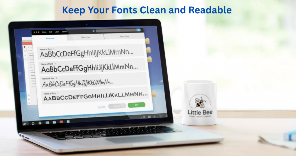
Fonts play a big role in how people experience your website. Choosing clean, easy-to-read fonts helps visitors focus on your message instead of struggling to understand the text. Avoid fancy or hard-to-read fonts, especially for body text.
It’s best to stick with one or two fonts. Use one font for headings and another for the main text. This keeps things simple and neat. Also, make sure your font size is big enough to read comfortably on both desktop and mobile devices.
Good fonts also create a professional look. When your text looks clear and organized, visitors will trust your site more. So, pick fonts that match your style but always put readability first.
Choose Colours That Match Your Brand
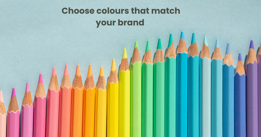
Colours are a powerful way to show your brand’s personality. Pick colours that reflect your business and feel right for your audience. For example, blue can feel calm and trustworthy, while red feels bold and energetic.
Limit your palette to two or three main colours. Too many colours can make your site look messy and confuse visitors. Use one colour for buttons and calls-to-action to make them stand out.
Also, think about contrast. Make sure your text is easy to read against the background colour. High contrast keeps your site accessible for everyone, including people with vision problems. When you use colours thoughtfully, your website feels balanced and professional.
Make Your Call-to-Action Stand Out

A call-to-action (CTA) is one of the most important parts of your website. It tells visitors what you want them to do next—whether that’s contacting you, booking a service, or signing up for a newsletter. To make your CTA stand out, use bright, contrasting colors that catch the eye. Make the button large enough to click easily but not so big that it feels overwhelming. Clear and simple text works best—use action words like “Get Started,” “Contact Me,” or “Book Now.”
Place your CTA where visitors can easily see it, such as near the top of your page or right after a key message. Avoid putting too many CTAs on one page, or your visitors might get confused. The goal is to guide them smoothly toward taking the action you want without distraction. When done right, a strong CTA can boost your chances of turning visitors into clients.
Use Space to Make Things Easy to Read
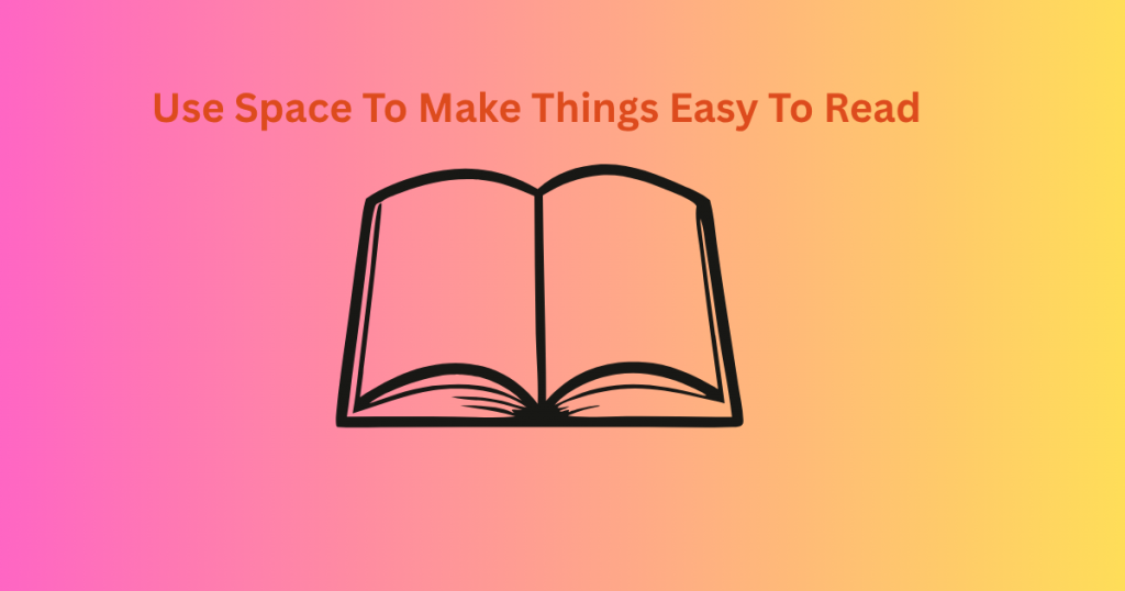
Whitespace, or empty space on your website, might seem like wasted space at first. But it’s actually one of the best design tools you can use. Good use of space helps separate different parts of your page so visitors don’t feel overwhelmed. It gives their eyes a break and makes reading easier. When text and images have room to breathe, everything looks cleaner and more professional.
Try not to crowd your content. Leave margins between paragraphs and sections, and avoid packing too many elements close together. Even small gaps can make a big difference. A neat layout that uses space well keeps your visitors focused on your message. It also helps important parts of your website, like your services or CTAs, stand out naturally.
Only Add What You Really Need
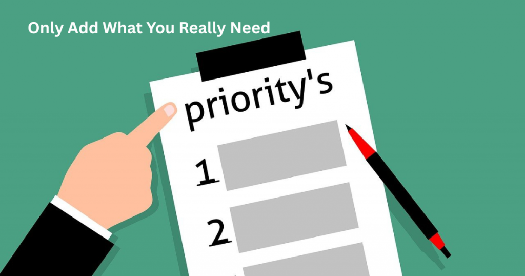
Less is often more when it comes to website design. Adding too many buttons, images, or text can confuse visitors. Instead, focus on the essentials that help tell your story and guide your visitors. Think about what your audience really needs to know and remove anything extra. This way, your site stays clean and easy to use.
Cutting down on clutter also speeds up your site, making it load faster. Fast sites keep people interested and improve your search ranking too. Every item on your website should have a purpose. If something doesn’t help visitors understand your business or take action, it’s best to leave it out. Simple and focused designs are easier to manage and look more professional.
Use Real Photos When You Can

Using real photos on your website can make a big difference. When visitors see genuine pictures of you, your team, or your work, it builds trust right away. People like to connect with real faces and real spaces, not just stock images that feel fake or overused. Real photos tell your story and make your brand feel honest and approachable.
If you’re a freelancer, show yourself at work or with clients (with their permission). If you run a small business, share pictures of your products, workspace, or events. Even simple photos taken with a good phone camera can be powerful. Avoid blurry or low-quality images—these can hurt your site’s look and make it seem unprofessional.
Remember, photos should support your message, not distract from it. Use images to highlight your services or showcase results. Real photos make your website unique and memorable. They help visitors understand what you do and why you care. So, whenever possible, choose real over generic photos for a better connection with your audience.
Design for Phones First
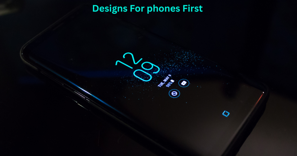
More people browse the web on their phones than on computers today. That means your website has to look and work great on small screens. Designing for phones first ensures your visitors get the best experience, no matter what device they use.
Start by making your menus simple and easy to tap. Use large buttons and clear fonts that don’t get too tiny on mobile. Avoid too many pop-ups or complicated layouts that can confuse phone users. A clean, easy-to-navigate site keeps visitors happy and lowers the chance they’ll leave quickly.
When you design with phones in mind, your site loads faster and stays readable. This can help your search ranking, too. If your site looks good and works well on a phone, it will also work nicely on tablets and computers. Always test your website on different devices before you launch. Designing for phones first is smart and keeps your audience coming back.
Test Your Site With Friends or Clients
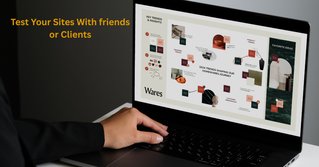
Testing your website with other people is one of the smartest steps you can take. When you’ve been working on a design for a while, it’s easy to miss mistakes or confusing parts. Friends or clients can give fresh eyes and honest feedback.
Ask them to try out the site like a visitor would. Can they find the contact info easily? Does the menu work? Do the images load quickly? Is the text easy to read? These simple questions can show you where your site needs improvements.
Testing also helps you understand what works well. You might learn that some features are great but others slow visitors down. Taking the time to test before going live can save you headaches later. It makes sure your website is clear, helpful, and ready to impress. Don’t skip this step—it’s a chance to make your site better for everyone.
Final Thoughts
Fixing common website mistakes can make a huge difference in how visitors see your business. When your site is clear, easy to use, and works well on all devices, people are more likely to stick around and become clients. Start with small changes and keep improving step by step. Remember, your website is often the first chance to show who you are and what you do best.
If you have questions or want personalized advice, don’t hesitate to get in touch. You can email me anytime at info@salahs-portfolio.co.uk. I’m here to help you create a website that really works for you.
FAQs
1. How many fonts should I use on my website?
It’s best to use one or two fonts to keep the design clean and easy to read.
2. What is the biggest homepage mistake freelancers make?
Putting too much information or too many images on the homepage can overwhelm visitors.
3. Why is mobile design so important?
Most people visit websites on their phones, so your site must look good and work well on small screens.
4. How can I make my contact info easy to find?
Place it at the top or bottom of every page, and consider adding a contact button.
5. What happens if I use low-quality images?
Blurry or pixelated photos make your site look unprofessional and may turn visitors away.
6. How can I speed up my website loading time?
Use smaller image files, reduce animations, and choose a reliable hosting service.
7. What is a call-to-action (CTA)?
A CTA is a button or link that tells visitors what to do next, like “Get a Quote” or “Book Now.”
8. Do I need to know SEO to have a good website?
Basic SEO helps people find your site. Use simple keywords and clear titles for better results.
9. Why should I ask others to test my website?
Fresh eyes can find problems or confusing parts that you might miss.
10. Can I update my website later?
Yes! Your website should grow and improve as your business changes.

I’m an organised and curious person with a passion for technology and investigative work, currently developing my skills through hands-on experience and IT studies. I enjoy solving problems, working with others, and learning something new every day.